

Since installing in a VM and getting a cursory look at Microsoft's newest OS, I decided to take the plunge and install it on a laptop and give it a more thorough test.
Although the system requirements are surprisingly low (1GHz dual core CPU, 4GB RAM, and 64GB storage), it does require a recent CPU (you can check here if your processor is supported), UEFI/Secure Boot enabled, DirectX 12, a 9" or larger 720p+ screen, and a TPM 2.0 module. Here is a list of full requirements for additional features.
Here are the specs on the machine I'll be testing with:
- Lenovo Thinkpad X280
- Intel i7-8650U
- 16G ram
- 240G SSD
- Upgrading from Windows 10 Pro 21H1
So after switching to the dev channel of the insider program the Windows 11 update was available.
First Impressions
Upon first going to the desktop, some things stand out: different icons for the standard directories (home directory folders like Pictures, Documents, etc), a centered start menu, and a taller task bar:
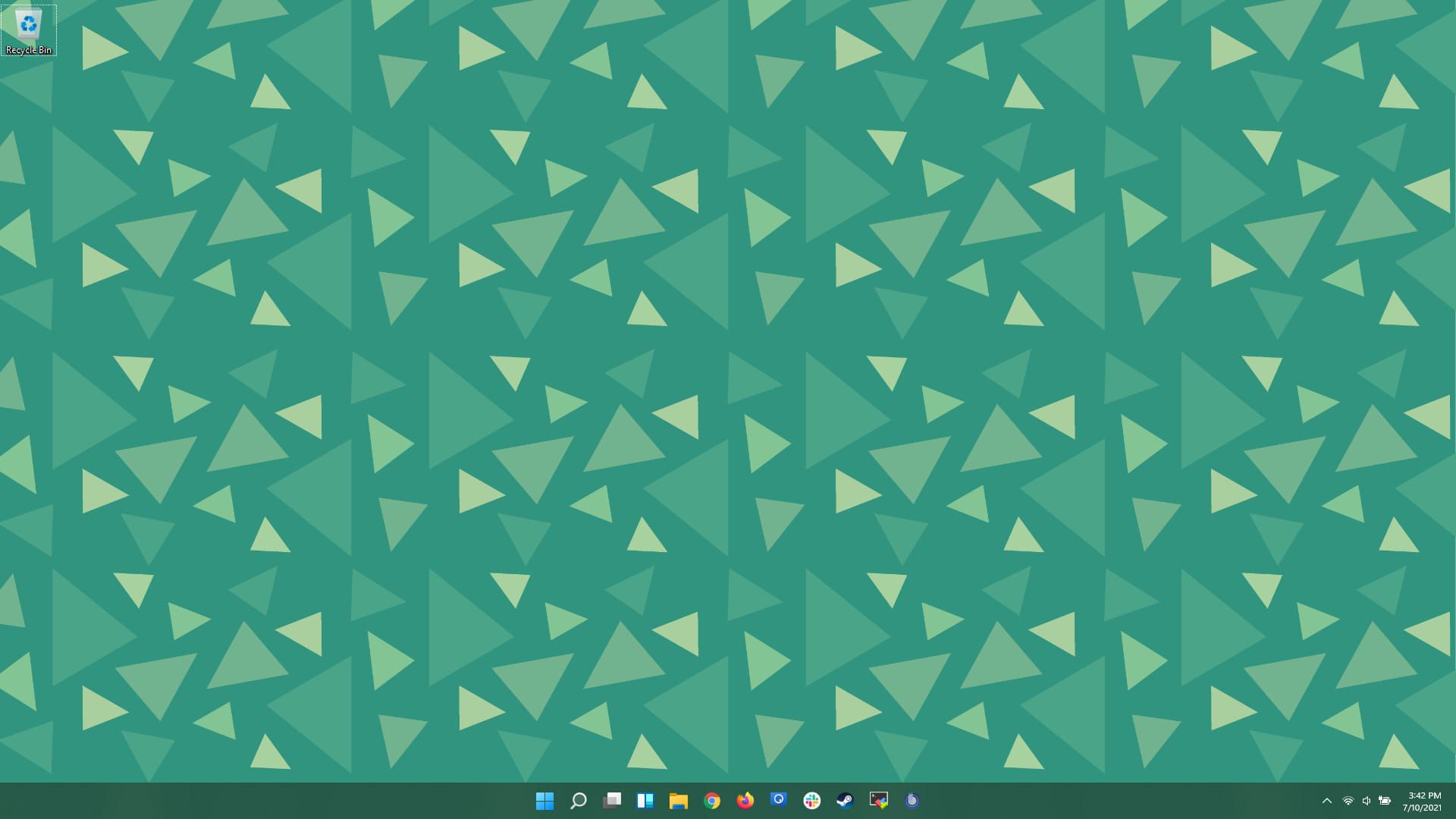
New desktop
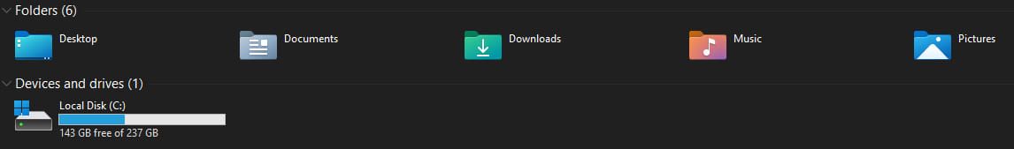
New folder icons
The new start menu: The start menu and task bar has been rewritten "from scratch" for 11. Overall I like this design more than the Windows 10 versions of the star menu. For many years my workflow is "press Windows key -> start typing to search for application". The new version doesn't change that workflow and the search seems MUCH better than Windows 10 for actually finding files and applications that I want as opposed to web searches or uninstallers.
Separating out the search feature does seem a bit redundant, and I do hope they merge it back into the main start menu, but when you start typing you are automatically switched to the search icon, so this is a minor quibble.
If you have a pending update, the shutdown icon will also give you an estimate for how long the restart/shutdown will take.
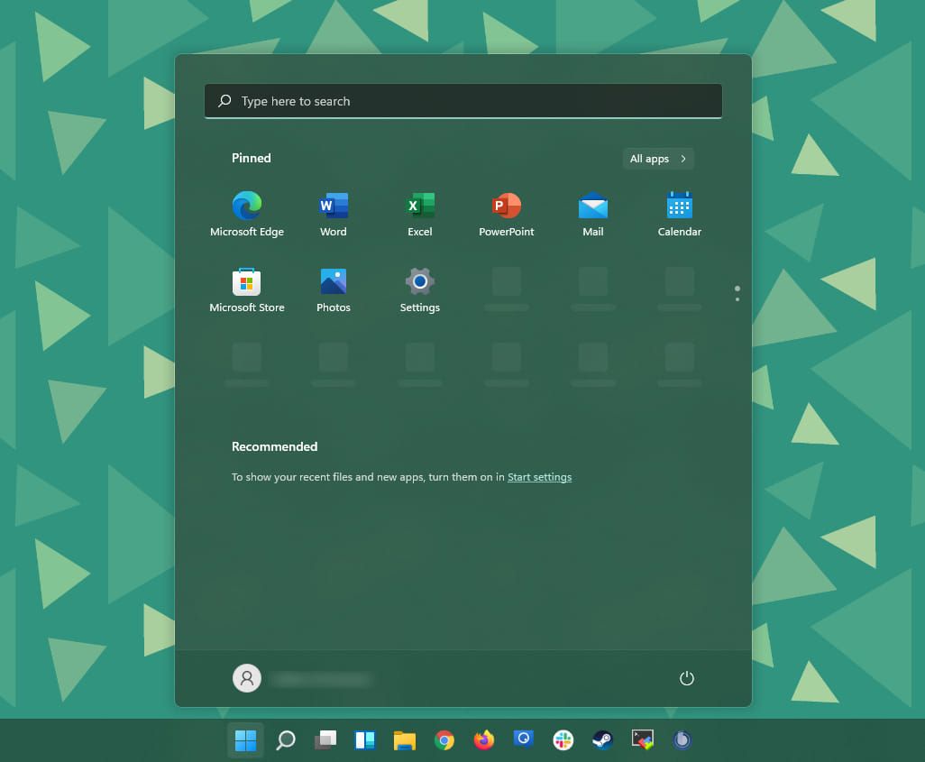
New start menu
The "News and Interests" widget that was introduced in Windows 10 in June has migrated to a Widgets menu
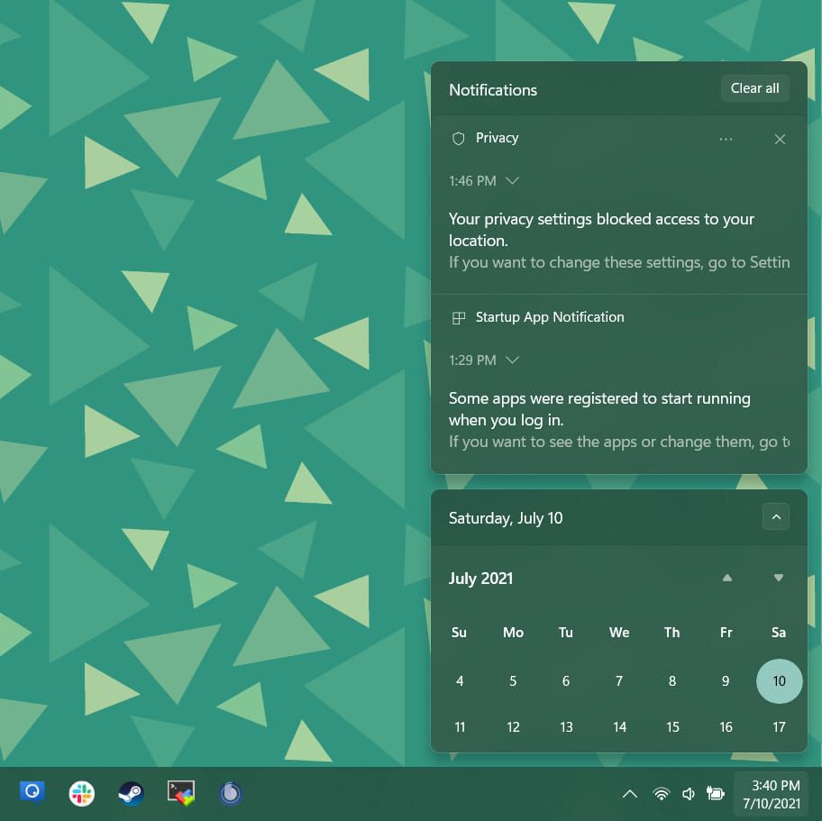
The notification panel has changed to a much more rounded, popup/toast style notifications that you get when you click the date/time.
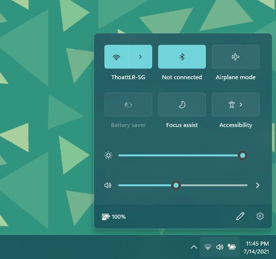
The taskbar settings have moved together to a much more mobile-like style - grouping all of the common settings together, similar to what you might have on your phone:
The window snap gives more options for snapping - adding to the half and quarter monitor window snaps, you also now get 1/3 and a bit wider than 1/3 "focused window" style snap layouts:
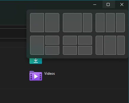
Window snap layout options
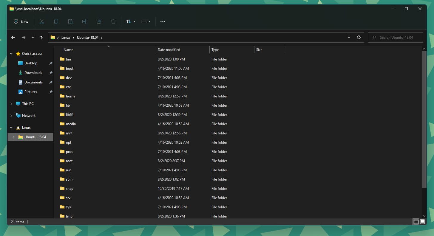
As with most of the updates to the rest of the interfaces, file explorer has become more touch-screen friendly - chunkier buttons and much cleaner:
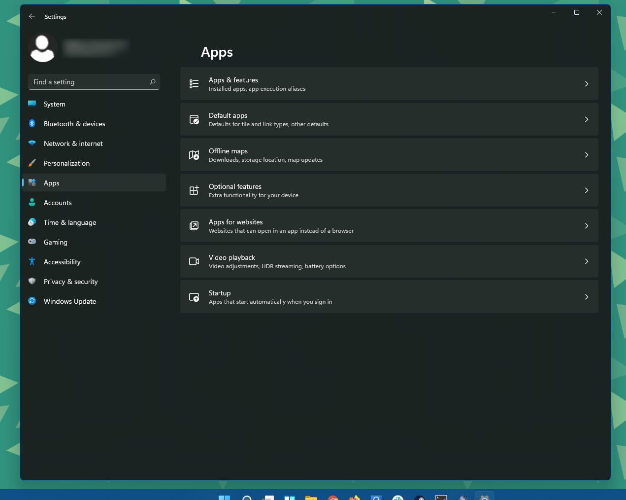
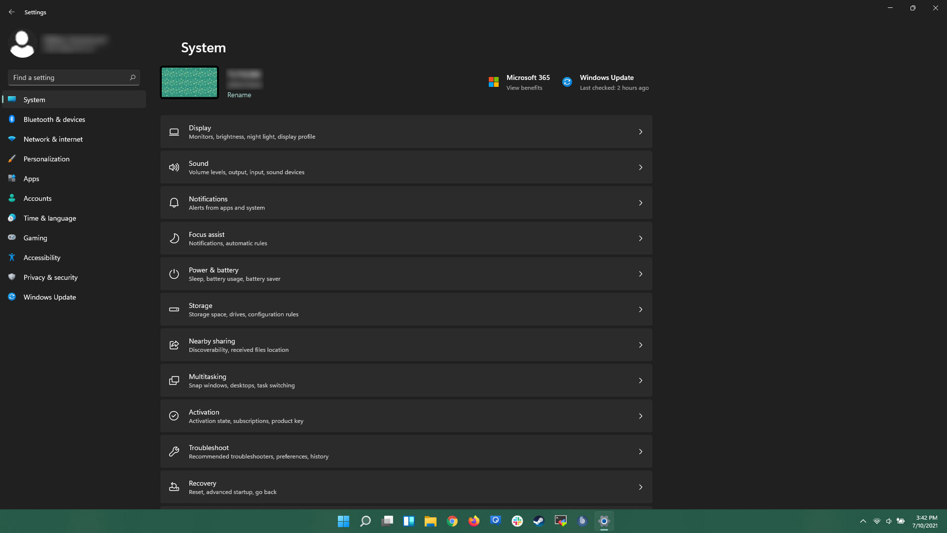
One of the biggest changes for me is that Microsoft has done a much better job of grouping (most of) the settings together in the settings menu. It feels easier to navigate and find the settings you are looking for. In Windows 10, there are a few areas that you can find settings: The Control Panel, the Settings app, etc. 11 has brought all of the disparate settings (mostly) back together.
The store also has had a facelift, although I don't really use it much:
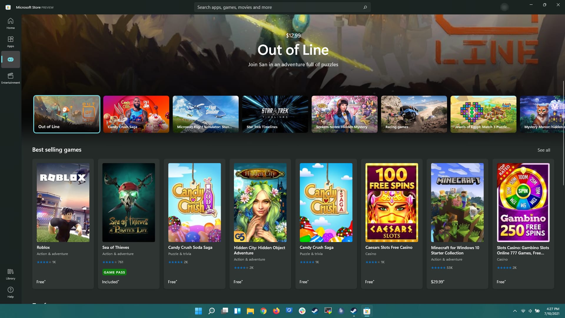
Eek
Currently there are a few things that have directly impacted my day-to-day workflow. Most notably is middle clicking an icon on the taskbar does not open another instance of the application, and shift+dragging a file to an icon on the taskbar does not act like opening the file with the application.
The new method to open another instance/window is to shift+click the icon.
File explorer and general keyboard navigation is noticeably slower as well
Conclusion
I will give an update after I've been using it more regularly, but initial impressions are very good. All in all, I like the facelift that 11 has undergone. The uniform settings, UI, and window snaps are worth the upgrade for me.